WHICH IS WHICH?
Colour is one of the most powerful tools we have as makers. It sets mood, creates contrast, builds depth, and guides the viewer’s eye. Yet three of the most commonly used colour terms — tint, tone, and shade — are often confused or used interchangeably.
This post breaks them down clearly and visually, using a custom colour wheel to show exactly how each one works and how you can use them intentionally in your creative practice.

Reading the Colour Wheel
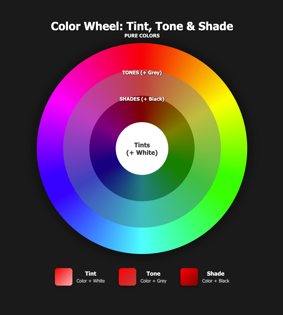
This colour wheel is designed to show how a single hue changes when white, grey, or black is added.
- Outer Ring – Pure Colours
The outer ring shows the full spectrum of pure, fully saturated colours. These hues contain no white, black, or grey — just colour at its strongest intensity. - Middle Ring – Tones
The middle ring shows those same colours mixed with grey, resulting in more muted, softened versions of each hue. - Inner Ring – Shades
The inner ring shows colours mixed with black, creating deeper, darker, more dramatic versions. - Centre – White (Tints)
The white centre represents tints. When white is added to any colour, you move inward toward the centre, lightening the hue.
Together, this wheel gives a complete picture of how every colour can be lightened, muted, or darkened.
A tint is a colour that has been lightened by adding white, making it paler, softer, and often more delicate while still clearly belonging to the original hue.
In plain terms:
👉 Tint = colour + white
Spin Words–style options (pick your vibe):
- A tint is a gentle version of a colour, created by mixing in white to soften its intensity.
- Tints explore lightness—adding white to a hue to create airy, pastel variations.
- A tint keeps the personality of a colour but turns the volume down.
Textile-friendly wording:
- Tints create light, luminous colours that feel fresh, calm, and open—perfect for highlights, space, and subtle contrast.
A tone is a colour that has been softened by adding grey (or by mixing both black and white), which reduces its intensity without making it lighter or darker in a dramatic way.
In plain terms:
👉 Tone = colour + grey
Clear, Spin Words–style options:
- A tone is a quieter version of a colour, created by adding grey to reduce brightness and saturation.
- Tones mute a colour’s energy, creating more complex, natural, and harmonious variations.
- A tone keeps the value relatively stable while calming the colour’s intensity.
Textile / art context:
- Tones are often seen in nature and aged surfaces, making them ideal for background fabrics, balance, and visual rest.
A shade is a colour that has been darkened by adding black, increasing depth and drama while keeping the original hue recognisable.
In plain terms:
👉 Shade = colour + black
Spin Words–style options:
- A shade deepens a colour by adding black, creating richness, weight, and shadow.
- Shades explore the darker side of a hue, adding mood, contrast, and visual grounding.
- A shade turns a colour down into shadow, giving it strength and presence.
Textile / art context:
- Shades anchor a composition, provide contrast, and help lighter colours shine.

This year we are working on a colour challenge with a difference.. Spin the Wheel… and we are focussing on colour education and exploration.
The spin the wheel is a subscription challenge which is designed and run by Brenda Wood of 2 Sew Textiles
